picture paints a thousand words. Not only can a single picture instantly tell you what a few words can’t, a picture also encompasses various cultures and breaks the language barriers in this global age of digital technology and mobile computing.
And so we see the influx of signs, symbols, logos, illustrations all around us. And of course, icons.
Icons are crucial in the ways we navigate computer screens or mobile devices for example. Like pictures in general, an icon in itself can be a quick graphic representation of a symbol many people understand—whether it may be a software tool, a shortcut to a program, function or data file.
So together with the rise of technology, we also embrace more new ways of developing icons.
Here are 5 popular icon styles from where you can find inspiration in creating your next “iconic” (no pun intended) graphics for your websites, applications or presentations:
Table of Contents
1.Skeuomorph

Skeuomorphism is a design principle in which design cues are taken from the actual physical world we live in. As such, it’s often applied to user interfaces like the use of folder and file images to denote a computer filing system. This gives a sense of familiarity for most users.
However, this icon design approach has been widely criticized for 3 main reasons:
- lack of ingenuity
- some classic elements it attempts to portray are no longer up-to-date with the younger generations
- the lack of creativity can also impede creation of more useful designs. That is, the design it depicts can be limited to physical objects even though computers are not restricted by these same constraints.
2.Glyph
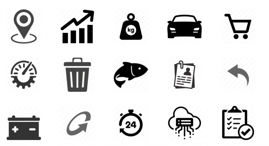
If there are icon styles that most closely resemble the way ancient Egyptians drew symbols on walls and tablets, it would be glyphs (hence, the term “hieroglyphics”).
Glyph icons are largely monochromatic, designed for simplicity and ease of orientation.
Originally designed for mobile applications, glyphs may be used in tab bars, toolbars and navigation toolbars as part of control buttons. They may also be suitable for creating visual navigation on websites and web applications for aesthetic purposes. Or to emphasize important information by using the icons in menus and lists.
3.Outline
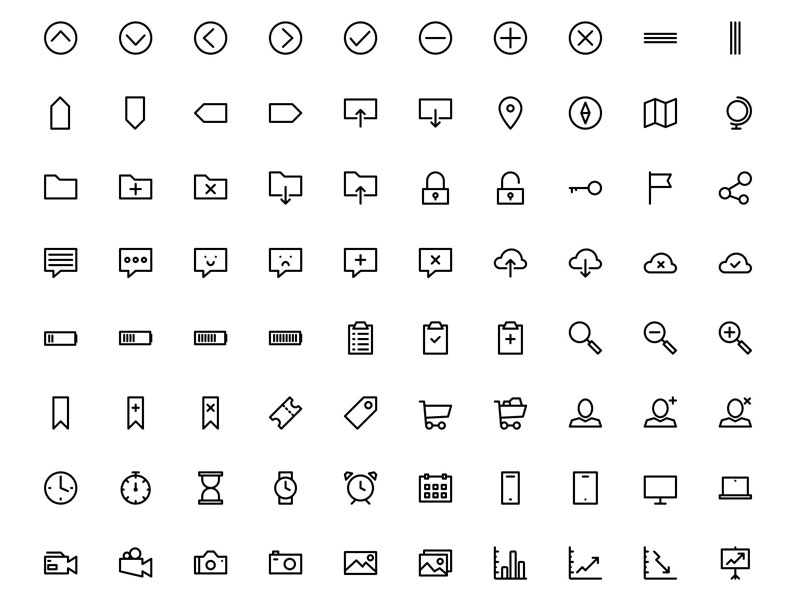
Modern and friendly, outline icons work perfectly with minimalist designs. They are ideal for bringing your sites, presentations and applications up to date easily.
As the term implies, outline icons are simple without making too much fuss about little, intricate details—only an emphasis on general shapes that speak a universal language.
4.Flat UI
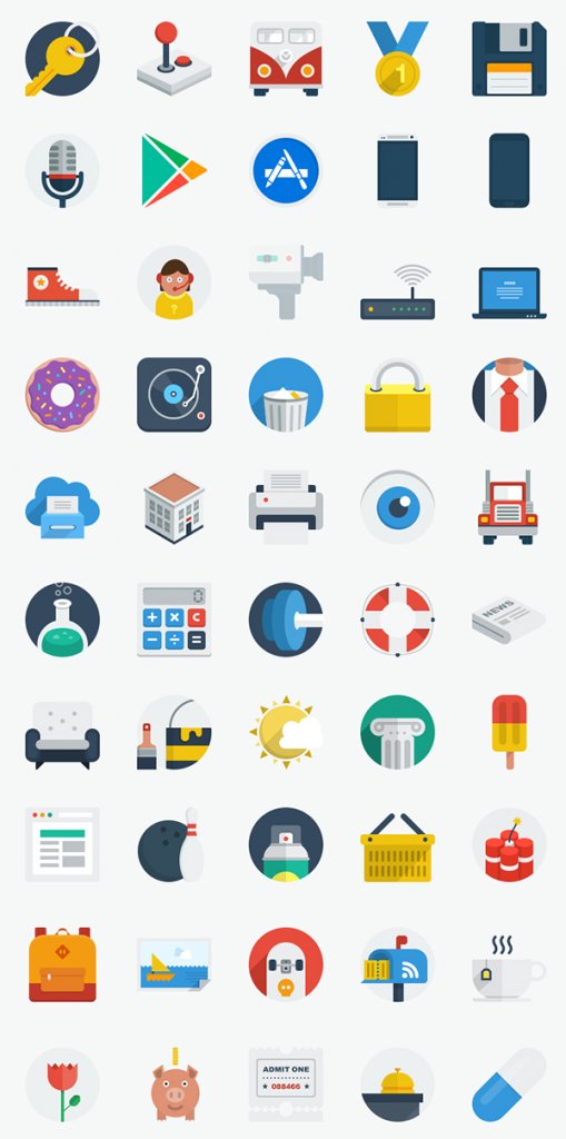
Like outline icons, flat UI icons are designed for a minimalistic approach using shapes or illustrations instead of a picture of a realistic object similar to skeuomorph. They were first adopted by Microsoft for their Windows 8 operating system.
Flat icons aim to strike a balance between simplicity and usability. They focus on open space, bright colors and flat graphics or illutrations without appearing too flashy or loud. Yet, they’re simple and classy enough without being too boring.
Ultimately, what flat UI icons deliver are clean, crisp edges with a flat two dimensional graphic layout. They depict a sophisticated look reflecting decency and style. Many website owners prefer flat icons because they are simple, clean, spacious and understandable to easily get their message across their intended audience.
5.Metro
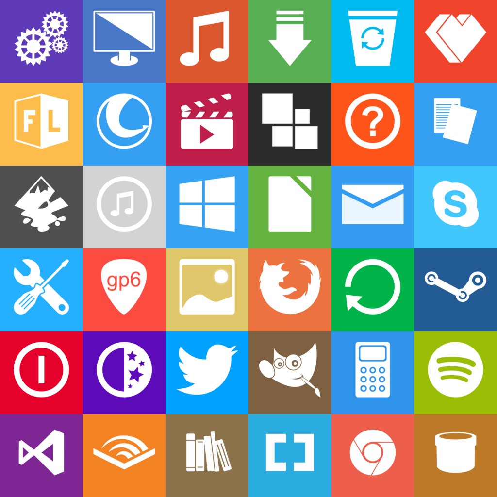
Like what it’s called, metro icons aim to express a sleek, quick, modern and clean look.
This design language was created by Microsoft primarily for user interfaces with emphasis on content of applications and typography rather than graphics. Some of its key design principles include animation playing a large part to give users the impression of an “alive” and highly responsive UI with an added sense of depth.
Metro icons are geometric focused icons to give users a “refresh” from the usual icon interfaces of Windows, Android and iOS. Like the design language where it belongs to, Metro icons were developed to create neatly designed layouts that are almost functional as they are attractive. In Metro’s earlier stages of development, CNET was quoted stating this design style as “more daring and informal”.


it is great slide icon, I like it very much.